How to make an awesome freelancer website (examples included)
Your website is a lot like your storefront—it’s where you want to drive potential leads to give them more information about your services, your experience, and style. Follow this guide to make sure your freelance website has all of the right elements.
Article contents
− +.jpeg)
Setting up a website for your freelance business is an exciting moment. On the one hand, a website makes it official—it’s a place you can send clients and leads to show them how your business works.
But on the other hand, making a website can be overwhelming if you’ve never done it before, and there’s no getting around the fact that it does take time.
It will be a lot quicker, however, if you have a plan before you start creating the site. In this article, we’ll cover off the most important elements of a strong freelance website, along with some examples to inspire you.
Getting started: How to build a simple website
The first thing you’ll need to do is register the domain you want. This typically only costs around $10 - $20 a year, and you can easily purchase the domains through a platform like Domain.com, GoDaddy.com, or CrazyDomains. Many freelancers use their name (like www.SarahSmithson.com), while others prefer to use a business name (like www.FreemantleGraphicDesigns.com). We’ve written an article about choosing a business name if you’re still unsure.
Once you have the URL reserved, the next step is finding a platform to host and build your website. You’ve probably heard of WordPress, which you can use to both host and build your website, but there are also options out there like Wix and Squarespace.
If you do opt for WordPress, you may find that the theme templates offered on the platform are good enough for what you want to do. But if you want to have a bit more control over the look and style of your site, plugins like Divi and Elementor are quite useful, even if you don’t know how to code.
You may need to invest some money upfront to afford some of these platforms, though most will cost you less than $100 - $200 a year. And remember, spending money on your business website is a tax deductible expense.
The most important elements of a freelance website
You’ve purchased the domain and now you’re ready to start building your website. So what needs to be included?
Here are the most important elements for any freelancer website, with some great examples from some folks who already nailed it.
Getting the language and tone right
When you’re building your freelance website, a big part of the job is using the right language and tone to connect with your readers. If you’ve built a portfolio before, you may be used to talking about yourself, your skills, and your services.
But when you are creating a website for the purpose of drawing in leads, you want to focus less on yourself and more on your potential customers and the problems they are struggling with that brought them to your website.
Take a look at this excellent example from Chima Mmeje, a content strategist and SEO copywriter at Zenith Copy. This appears right on her homepage:
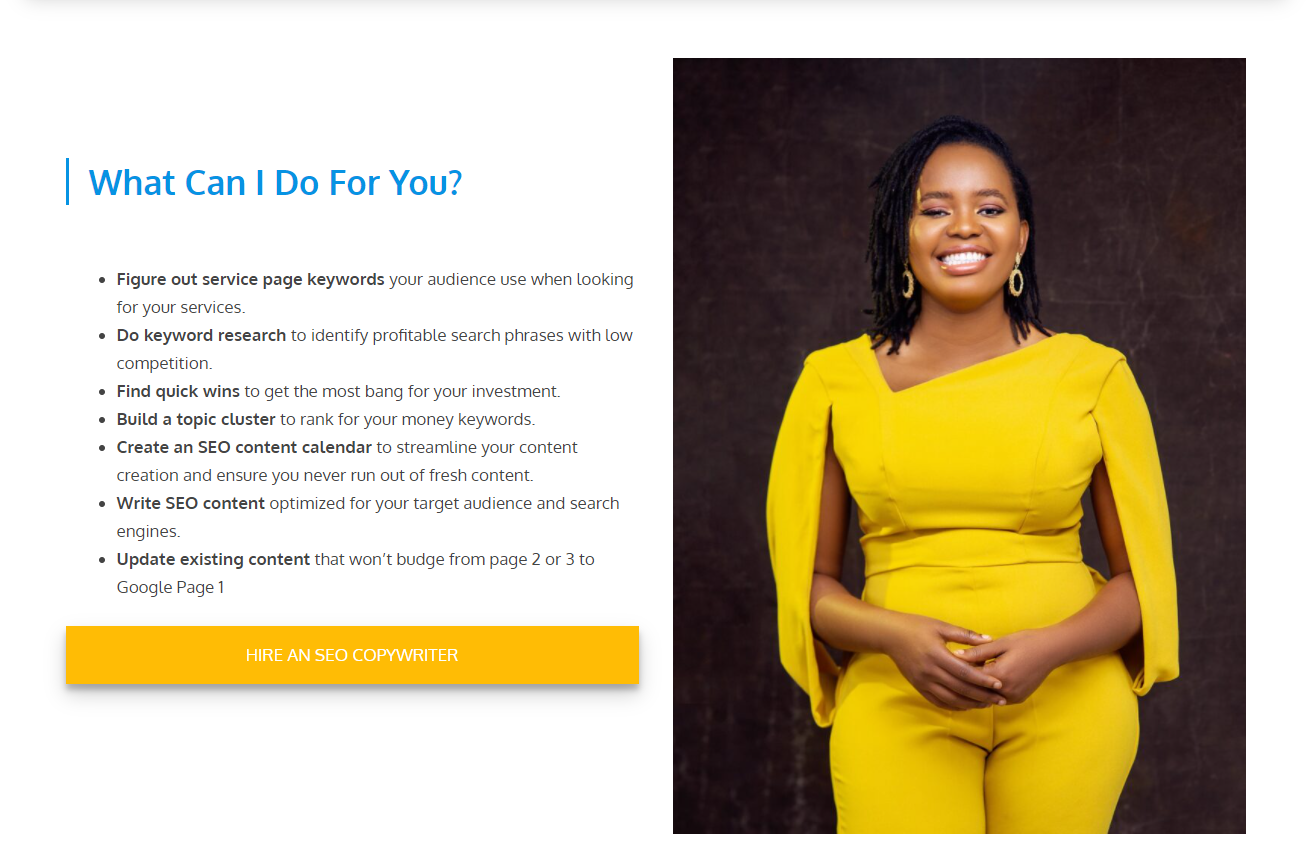
If you visit Chima’s entire website, you’ll see that every word she writes is geared toward the customer, their issues, and what she can do to help them. Even on her About page, she’s mostly talking about how her skills and experiences will help her customers.
To get the language right, it’s important that you develop your own unique selling point. This will help you understand exactly who your potential customers are and what they need, and you can then focus the copy on your site around them.
What goes on the homepage?
The primary purpose of the homepage is to catch the attention of anyone who visits it, show them exactly how you can help them, and direct them to other portions of your site as necessary.
Your homepage should have the most compelling information on it, and make it easy for anyone who visits your website to navigate to other parts of your website as they please.
There are many ways to put together a homepage, but there are a few elements that should always be there:
A menu bar that makes it easy to click over to other parts of your site
Your business name and logo
A call to action (such as contact me, book a call, etc.)
Testimonials from happy customers
A brief explanation of your services (linking over to full services pages if necessary)
An explanation of your process and the benefits customers get working with you
A footer that has links to all of the most important pages on your site
Your contact information (including links to your social media pages)
For an excellent example of a freelance website homepage that has all of these elements, check out web consultant Gill Andrew’s site. (Most of the examples we’ve featured here also have excellent homepages.)
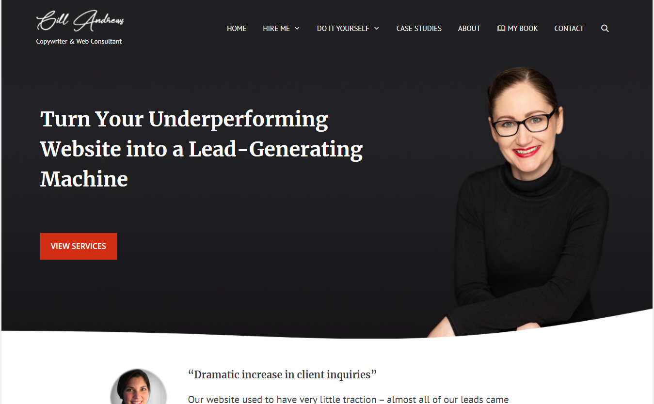
Showcasing your services (and prices?)
Hopefully, people who land on your website are so intrigued by what they see on the homepage that they want to know more about your services. That’s why it’s a good idea to have a separate page or pages dedicated to diving deeper into what you offer, how it works, and how much it might cost.
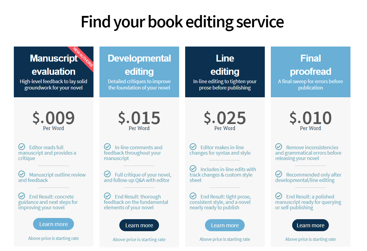
Take a look at this example from the freelance book editors at Invisible Ink Editing. On the homepage, they list out their services and price like as you see below, but they also give each service its own writeup.
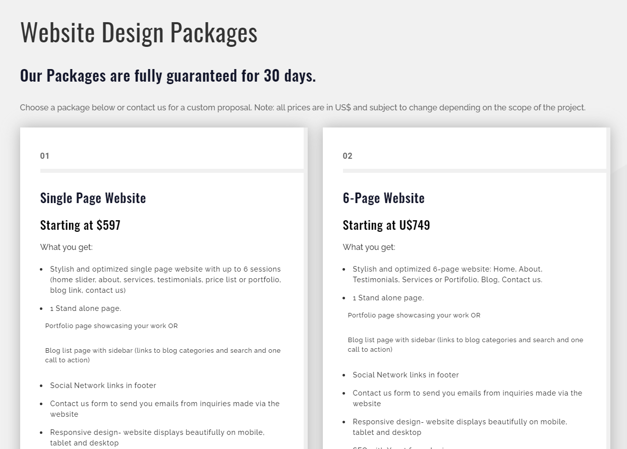
The web design service page from freelancer Adriana Thieme is a great example of how to put detail into your services to give customers a clearer picture of what you do.
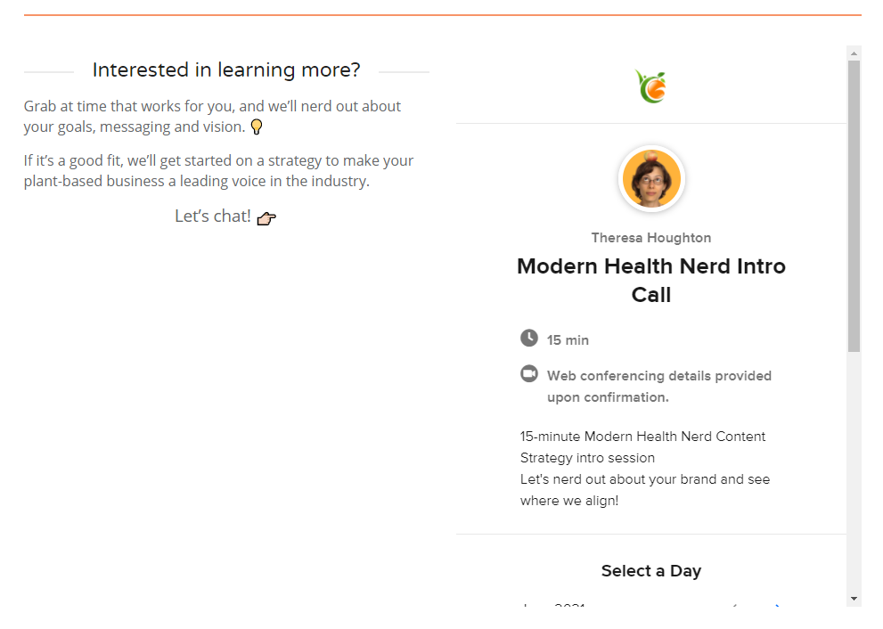
A note about putting prices on your site: It’s not always possible to give exact pricing until you have more information from your lead. If this is the case for you, you can use this to your advantage. Consider putting a form on your website asking for more information and promising a quote in return—this is a great way to open up conversations with leads. Here’s how health writer Sam Houghton does it on her site:
Integrating testimonials, case studies, and examples of your work
Before they are ready to sign up for your services, customers will want proof that you can make good on the claims on your website. There are three excellent ways to do this:
Testimonials
There is little that is more compelling than a good testimonial. It’s good practice to routinely ask your happy customers and clients for feedback to feature on your website. Once you have these, you can place them throughout your site to underscore your abilities.
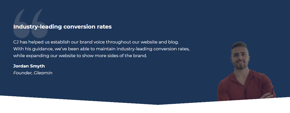
Here’s an example from conversion copywriter CJ Haughey’s site. His customer has great things to say about the specific benefits CJ brings to the table, which is why CJ placed this one right on his homepage:
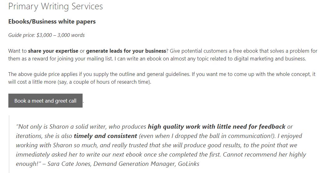
And writer, educator, and anti-racism activist Sharon Hurley Hall puts testimonials underneath the descriptions of her services, to encourage people who are considering hiring her.
Case studies
Case studies are an excellent way to show your customers the details of how you’ve helped them in the past. In our interview with case study specialist Anfernee Chansamooth, you can see some examples of excellent case studies:
A portfolio
If you have examples of your actual work to show, then creating a portfolio right on your website is a good idea. We’ve already covered how to create an awesome freelancer portfolio here, so be sure to check out that article for lots of good examples.
Contacts and calls to action
When building your website, you should be focused on making it easy for your audience to take action. If it’s not simple to get in touch with you at any point as they journey through your website, then they are likely to close out your site and never return.
That’s why having clear calls-to-action on your website is so important. Your calls to action will depend on what you want your customers to do on any given page, but some of the most common calls-to-action are:
Get in touch
Book a consultation
Download a resource
Get a quote
Connect with me on social media
Subscribe to a mailing list
Send your information
Here’s an example from content marketer Lauren Lang, who uses a bright yellow button to encourage people to book a call with her. The link leads directly to a booking engine:

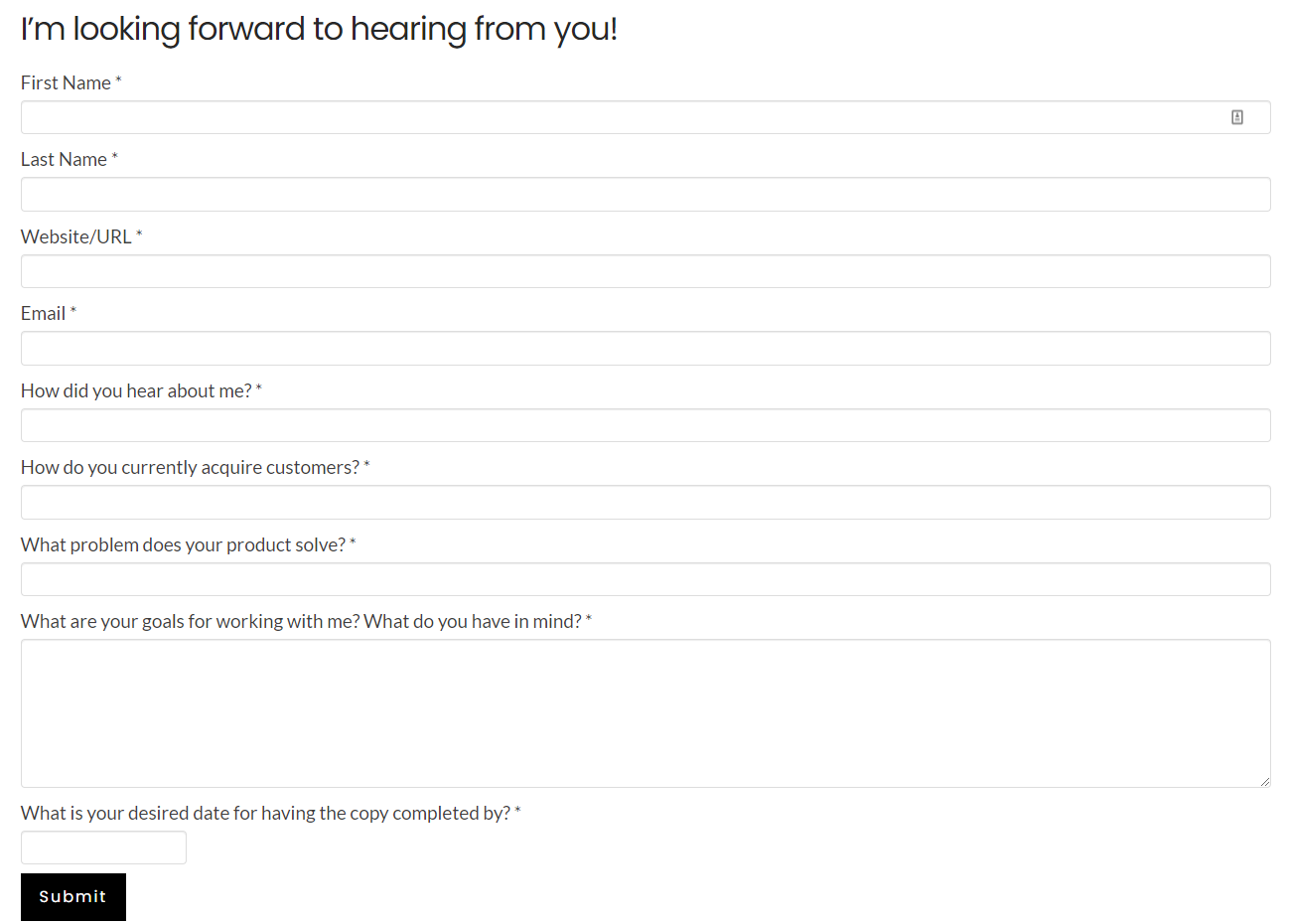
For your contact page, you want to make sure you gather all of the necessary information to make it easy for you to reach out and start building a relationship with leads. See how SaaS copywriter and PR expert Dayana Mayfield does that here with her contact form:
The “About Me” Page
A good “About Me” page will add a human element to your freelance website. It’s a chance for you to talk more personally about who you are, what your experiences have been, and how you like to work.
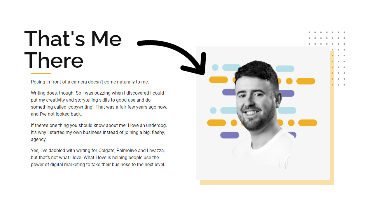
Here’s a strong example of an About Me Page from copywriter Alex Thompson, who uses the page to not only introduce himself, but also showcase his processes.
Do you need a blog?
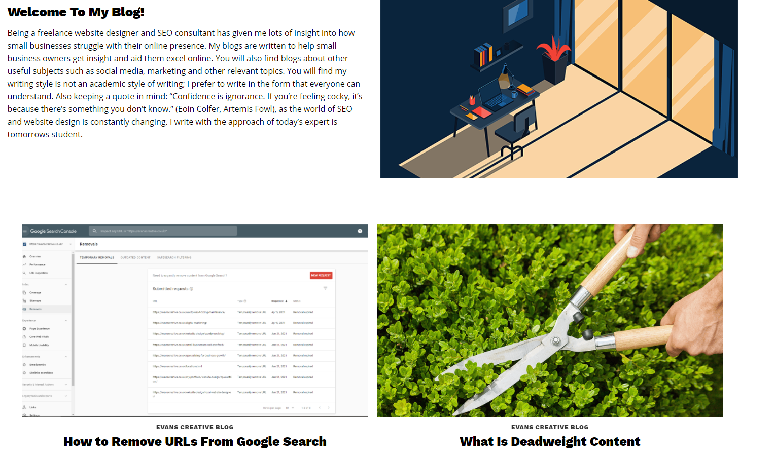
Having a blog on your website, or a library of resources, can help you establish credibility and show your expertise. On top of that, with a little bit of know-how, you can optimise your blog content for SEO, to bring in even more leads through your content.
Since he focuses on SEO, it’s no surprise that freelancer Chris Evans has an excellent example of a blog on his site:
If you don’t think you’ll be able to publish a blog at least once a month, then it may be best to hold off on this element of your site for now. An old and out-of-date blog can be a bad look when you’re trying to court new leads.
We hope these examples were helpful as you start building your freelance website. It certainly takes time to put together a fantastic website, but it’s a good investment for the long-term future of your freelance business.
Cover Photo by Campaign Creators on Unsplash
Join newsletter
ABOUT ROUNDED
Invoicing and accounting software for sole traders. Get paid faster and relax at tax time.
