


Designing a new dashboard
For a few months I’ve been wanting to overhaul our dashboard as it really was a relic of our beta. Nearly every part of Rounded has seen plenty of redesign and tinkering, mainly to improve user efficiency and accommodate new features, sometimes purely for aesthetics.
Article contents
− +
In hindsight it’s easy to see why the dashboard became neglected – in itself it doesn’t hold vital functionality and our users didn’t spend much time on it.
The fact users weren’t spending time on this screen is a giant red flag. The dashboard is the first page a new user lands on after signing up and also the first our regular users return to. That initial user experience needs to delight on both occasions.
Behold the old dashboard:
We weren’t winning any prizes for looks and certainly not for utility. I use Rounded frequently for my own invoices, expenses, BAS and tax returns. After that initial login I never came back to the dashboard simply because it offered nothing of real value.
We certainly could do better than this. The main things I wanted to address in the redesign were:
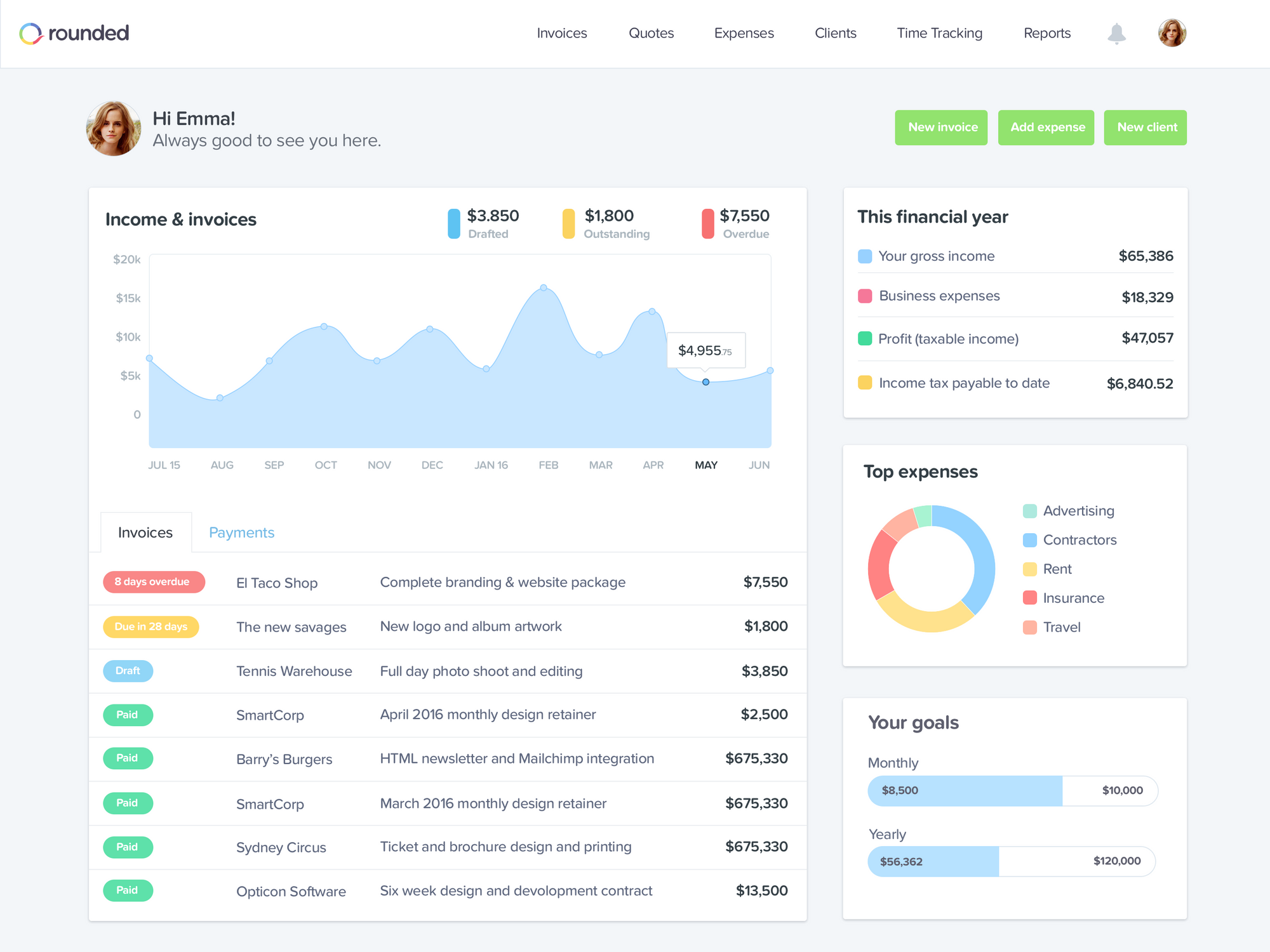
Quick access to useful data
More meaningful statistics
Improve the aesthetics & engagement
Quick access to useful data
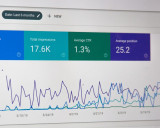
A trip to Google Analytics revealed invoices were the most requested part of Rounded by a clear margin. In fact, the numbers were almost identical to that of the dashboard meaning nearly every Rounded user consistently spends most of their time on the invoice index page. Which isn’t all that surprising.
Invoices were obviously the leading candidate to be promoted to the dashboard. However there are some real estate limitations at play here so I needed to cut down the visible data to the invoice status, the client a general description and the invoice total.
The bonus with our invoicing component is that all functionality is portable so what’s available on the full index page is also available here with no extra dev effort. This means our users no longer have to leave the dashboard to action an invoice.
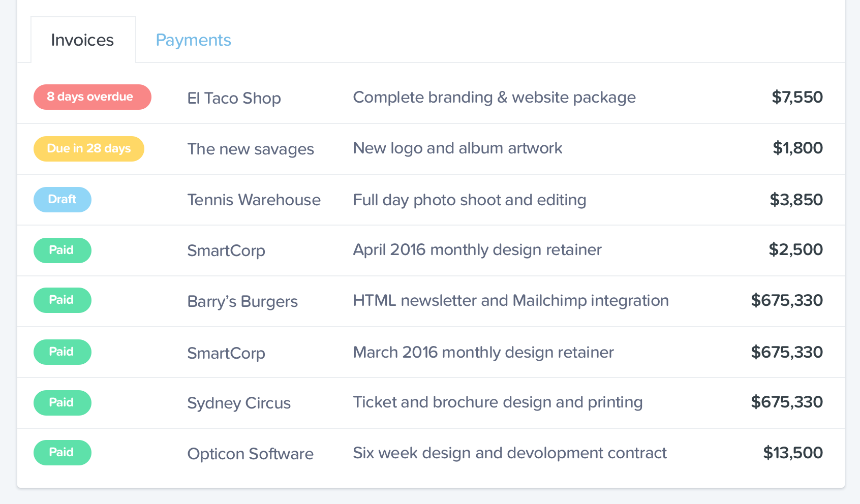
Invoice payments are also available in another tab, they pair well with the income graph above. However once tabs were introduced I had to fight the temptation to add even more tabs with superfluous data. That’s not to say I didn’t try, but the result was always something I felt would overwhelm our users.
More meaningful statistics
The old dashboard had some stats I initially thought were helpful and a basic profit and loss statement enclosed in a giant doughnut chart.
I wanted to give our users a visual representation of their income for the last 12 months running. Everyone loves a pretty graph and when you see it populated with your own data it can provide some real insight to the ebbs and flows of your income over the course of a year.
In further iterations we’ll certainly overlay multiple years and datasets onto this graph to add some real analytical power. Overlaying expenses and goals would be nice and wouldn’t require much dev effort. This will come but lets keep it simple for now.
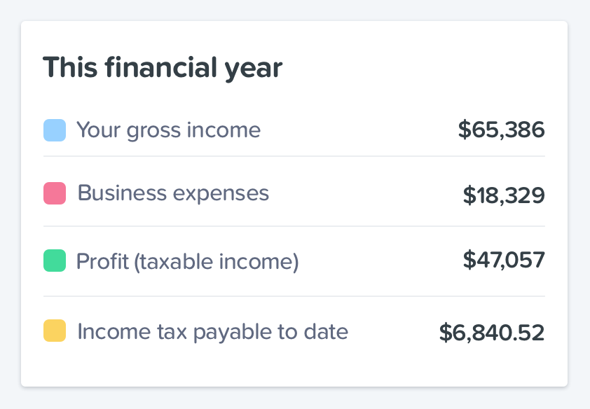
The most valuable addition to the new dashboard is rather unassuming. With Rounded I’ve always wanted to remove many of the unknowns a freelancer or sole trader suffers in their business. One of the biggest gripes I had while freelancing was not knowing how much tax I owed the ATO until I submitted my tax return. It was always more than I thought, which can hurt. A lot. After speaking to our users and many other freelancers I sure wasn’t alone in my frustrations.
The solution was simple and the math unimpressive, we just ran the user’s profit (gross income minus expenses) through the ATO’s tax table for the current financial year. Voila. Super useful information and not something I’ve seen in another accounting app.
A fresh coat of paint and goals
Finally the aesthetic needed to be brought up to par. I never want Rounded to look or behave like a traditional accounting application and the dashboard was an opportunity to enforce this. Colour was always going to play a leading role and it certainly helps bring the page to life.
The redesign also brings some aspirational features in the form of goals. A freelancer’s income is notoriously unpredictable but we all have targets we must or would like to meet every month or year. Goals is a step in that direction and attempt to bring some stability and sense of progress to a freelancer’s business. There’s more we can do here and we’re really excited about some ideas we’ve come up with for future revisions.
Summing up
The new dashboard has only had a few days out in the wild but user feedback has been positive which gives me confidence the initial objectives have been achieved. Room for improvement? You bet. We’ll let the dust settle on this deployment for a few weeks and see where we can ameliorate based on feedback and analytics.
Contents
Join newsletter
ABOUT ROUNDED
Invoicing and accounting software for sole traders. Get paid faster and relax at tax time.